Sometimes I also wonder why I sign up for another course. Reason enough: learning new things, challenging myself and having the good feeling of being in a ‘class’. A class with like-minded people. Talking together, complaining, laughing, looking at each other’s work, giving tips. And that happened plenty during the Inkygoodness Branding Challenge. Not only by the mentors Lisa Hassell and Luke McConkey, the ‘clients’ Flow Creative, Vault49 and Hedof but also by the other participants. And I really needed that for a while. Just doing. Step by step finishing and submitting your project.

Okay, but what is it? A 28-day branding challenge?
Lisa Hassell, founder of the Inkygoodness collective invited 3 different ‘branding experts’. This time, they were FlowCreative, Vault49 agency and Hedof. These different experts created very different briefs for the participants. The design agency Vault49 gave the first assignment: designing packaging for a special summer edition of the drink Casatera. The brand colours and the arch with the brand name in it must be kept. So for your own input, literally not much room is left. A challenge.

deze beelden zijn van Vault49 en Casatera.
For each assignment, this homework returns:
1 Creating a mood board
2 Sketching and visual research
3 Colour sketches
4 Final work
With dealine. A few days after the deadline, some 10-12 submitted works are discussed by the clients in a hem conversation. In between are workshops with Lisa or Luke where you can ask questions and discuss your work. Together with other participants. Very inspiring and motivating.


Vault49 • limited edition Casatera Guava Lemonade
Designing the can didn’t go so well for me. I thought I had a brilliant idea to tie in with the Summer Olympics. Since Casatera’s instagram account showed sporty, muscular beautiful people (around the pool), I thought it would be fun if Casatera organised the ‘pool Olympics’. Well. Of course, they don’t want that at all. They want a cool look. I stuffed the little tin with guavas and people playing. Endlessly I fiddled with the small area: different tiles, more swimmers, more plants, fewer plants.
This is clearly a case: handed in on time and learned a lot.

FlowCreative • campaign on mental health teens
But meanwhile I have already attended two more inspiring master classes: by Murugiah and by Franz Lang (in week three a master class by Katie Lukes). These and the positive atmosphere in the group make you bravely continue: what a lot of beautiful things are happening in the illustration world. And meanwhile, we are already well under way with the second assignment: making a ‘hero image’ and three spots for a campaign on metal health in teenagers. Flowcreative. Flowcreative works a lot with animations and had special examples of their work.


For this ‘Mind’ project, I thought carefully about how to make text and image work together and the use of the ‘brand colours’. Karl from Flowcreative had given feedback on the final work for each participant. For me it said, among other things: “these are great. As editorial illustrations around the subject of mental health they work really well. Could I see a charity using them for a national campaign? Not sure. But I would like them to!”
I understand that very well. That he thinks it’s an editorial work 😉 But an editorial work I would like to make more of: pencil and loose. So for me -in addition to this fine feedback- a win.


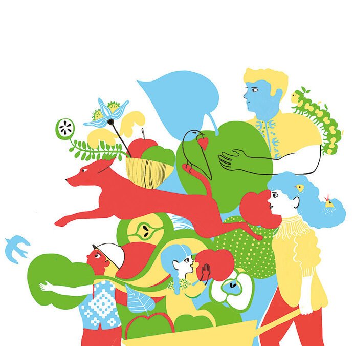
And we continue to work. The third assignment came from https://www.hedof.com/and Ukrainian art director Julia Donchuk. A fantastic project that I would really like to create something for. Rick (Hedof) had a clear and inspiring introductory lesson in which I was given many tools to tackle a ‘branding assignment’. I myself am very happy with the result and the feedback from Hedof and Julia of course:

This style is amazing, it’s kind of vintage, like from the old books, and I really love it! It has such a retro vibe There’s a lot of history of Eastern European children’s book illustration and this resonates a lot.
I like all of these playful elements like the caterpillar and the birds in in her hair and all of the small details and also the mixture between Just bigger shapes and and line work and how you have different rhythms and elements in the illustration without putting too much emphasis on one thing.
Loving the style, playful, fun, has character, family and is just a really nice image to explore with your eyes; it has a great atmosphere and feeling as well – on one hand nostalgic and on the other hand a contemporary approach as well.

For this challenge, I treated myself to some shiny new art materials
pencils for the Flow illustrations: blackwing
Markers for the Apple clears a Path illustration: apple green, red, yellow and light blue
I bought these markers in different sizes and decided to stick to these four colours. This set was my colour palette for this project.

